BRANDING | PACKAGING | ILLUSTRATION | TYPOGRAPHY | CASE STUDY
Nutmeg’s
Nutmeg’s is a theoretical cafe and bakery that aims to create a community in Philadelphia based around the love of artisan bread, fair trade organic brews, and sweet bakes. They believe that good food brings people together. So come on in, grab a sweet snack, and stay a while for goodness bakes!
Nutmeg’s was born out of a love of creating unique and exciting flavors and an old dream to open my own bakery one day. My goal was to create a fun and inviting brand for people to experience the joys of baking I felt then and now.
INSTRUCTOR - JASON KERNEVICH
RESEARCH
Nutmeg’s really started coming to life through the visual inspiration I began to gather. I found that many established cafes and bakeries tend to make fun color choices, use clean, vintage-inspired typography, and use some form of patterning or texture. Using this information, I created a mood board pulling some of these themes and combining them with the mood I thought fit Nutmeg’s. This mood board was adapted and changed a bit more as I explored the logo.
If you’re interested in seeing the full research document, click this link!
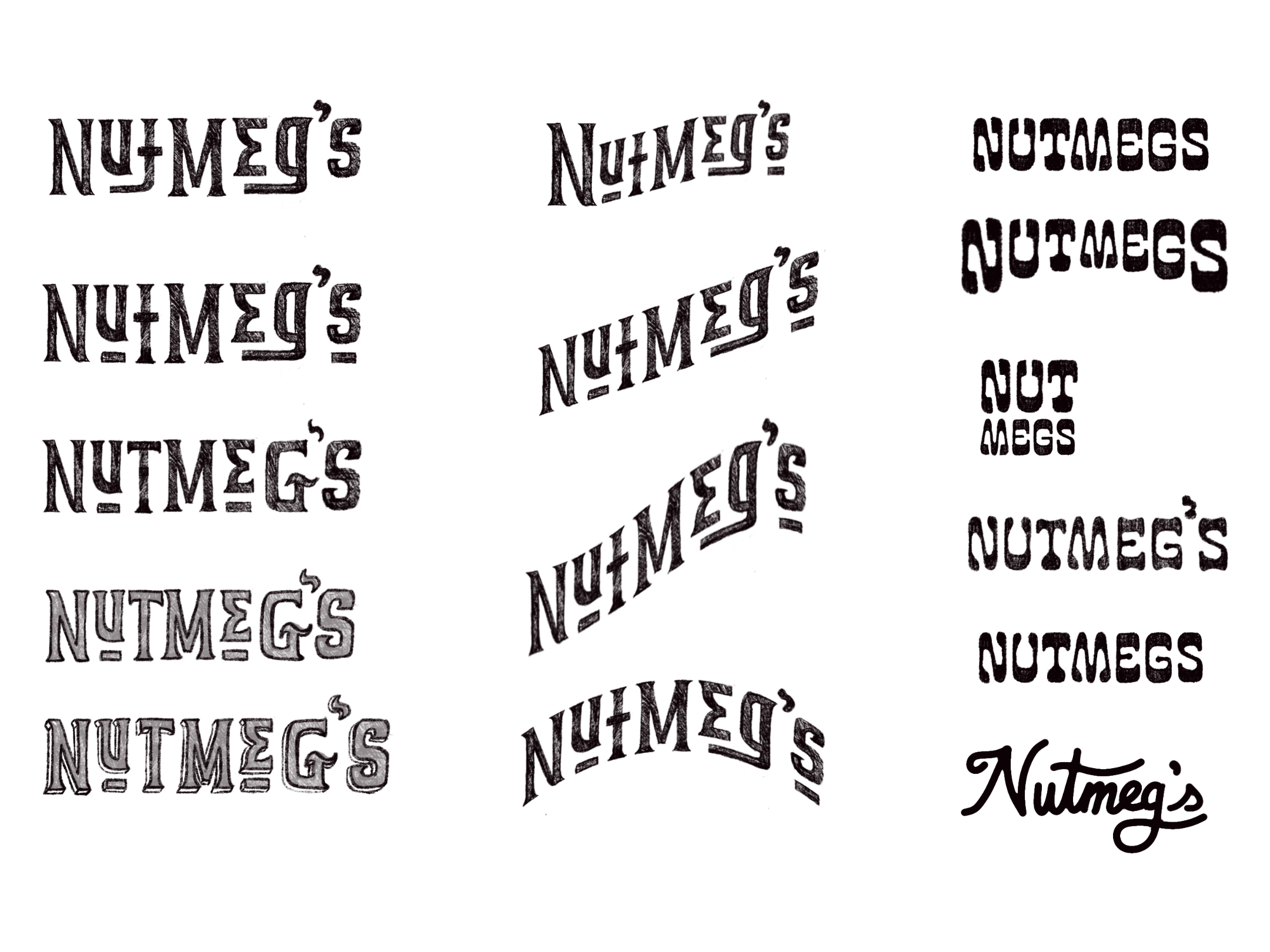
LOGO
My first thought when I jumped into the design of the logo was to lean into an artisanal goods vibe, but a little funky. I sketched and fiddled through some retro-inspired serif and sans-serif fonts but ultimately decided that these weren’t playful enough for the name “Nutmeg’s.” This led me to try and find a happy middle ground between the two: something funky and slightly wiggly while still maintaining legibility and structure. I chose Cooper Nouveau Regular because of its fun, friendly swashes, bulbous serifs, and clean legibility.
PRODUCTS
I knew from the beginning I wanted to create a pattern for my baked goods and packaging paper. It just felt so quintessentially right for a bakery. However, it needed something more freeform to match the brand's playful nature. So, I returned to the source and drew from the pattern of grated nutmeg.
FINAL DESIGNS
FINAL THOUGHTS
This project surpassed what I thought it could be when I started at the beginning of the semester. I had such a wonderful time brainstorming ideas for silly illustrations and puns. I even stepped out of my comfort zone with some aspects of design I haven’t played with as much such as typography, to see how much fun I could have with it and how far I could push it. Ultimately, this is a project I know I will want to keep adding to. There are so many ways I can imagine expanding it.